Doppler
Moving together.
About
project
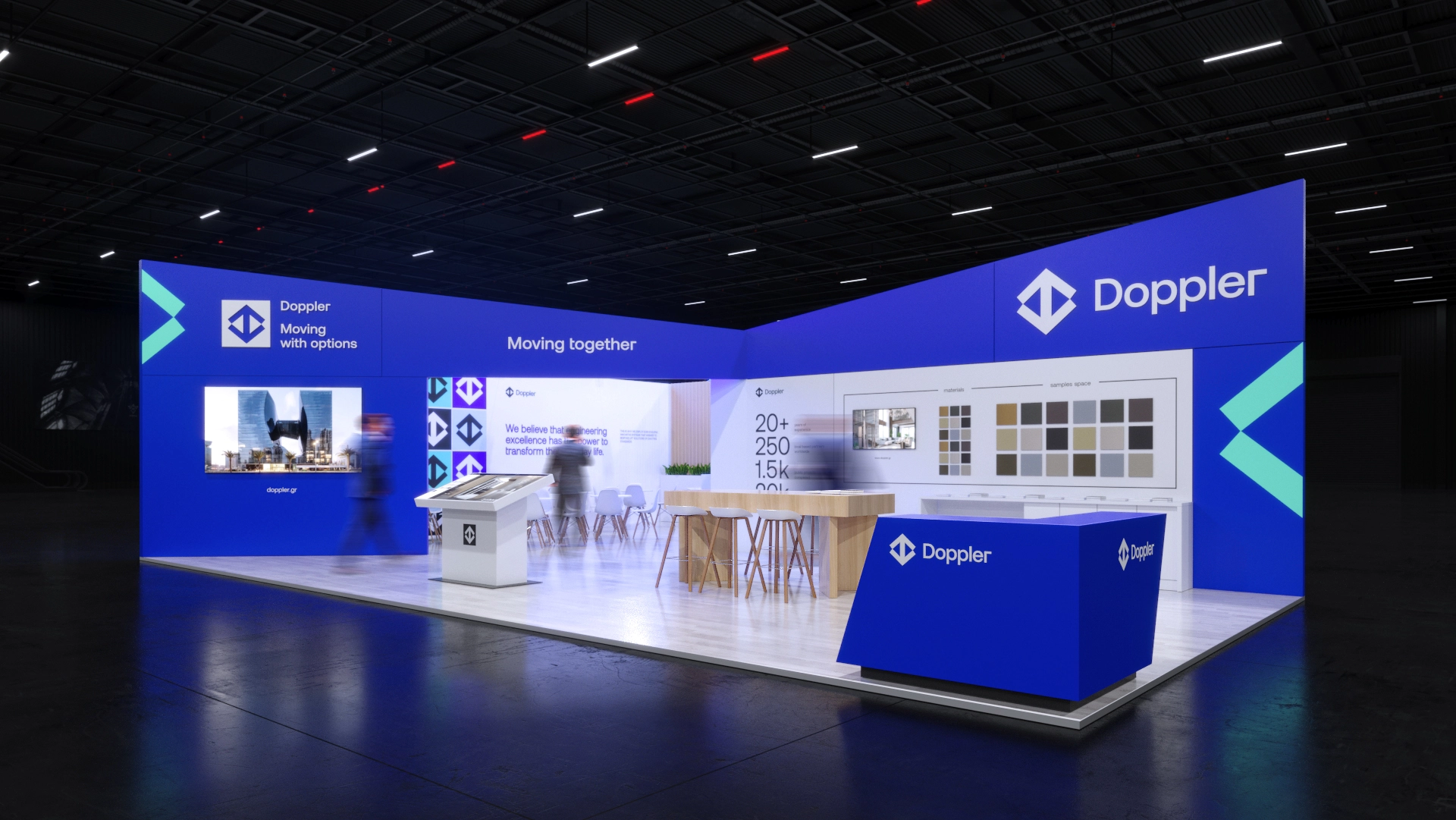
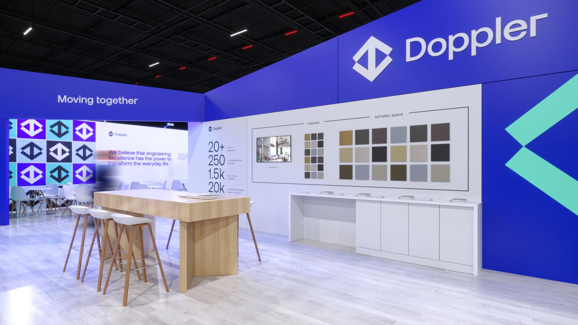
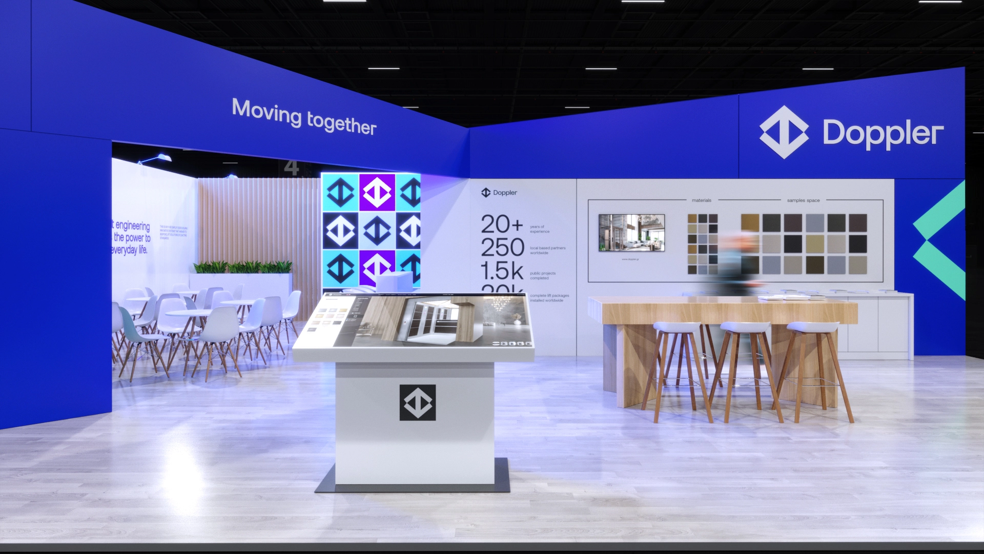
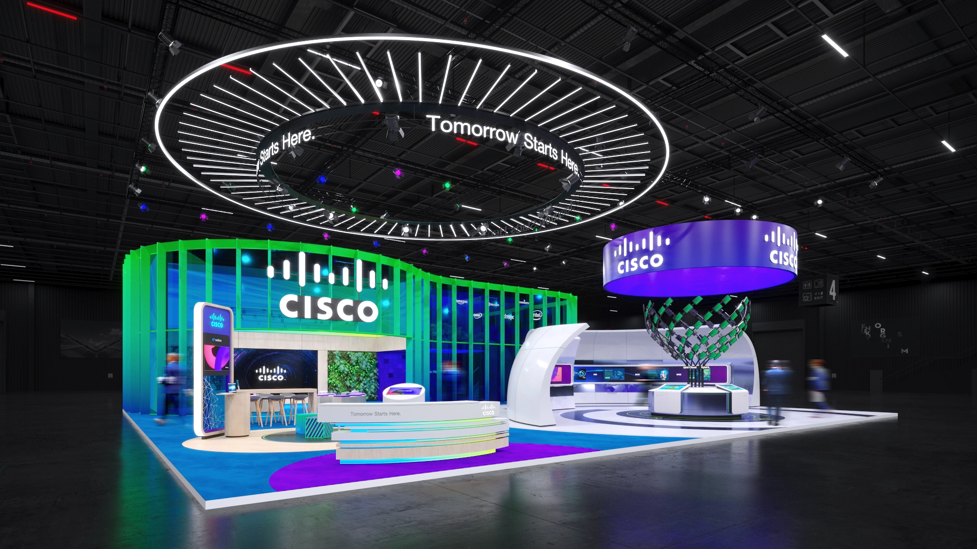
In the design of the Doppler exhibition stand, our primary goal was to elevate brand visibility through the strategic incorporation of logos, brand elements, and a vibrant corporate color palette. A deliberate decision led us to create a warm atmosphere at the stand’s center, seamlessly harmonizing with the backdrop of rich blue.
The architectural forms of the walls were purposefully engineered to ascend in height at the corners, introducing a dynamic visual rhythm while infusing a sense of rigor and stability. This intentional design choice also subtly echoed the distinctive contours of the company’s logo, adding a layer of brand identity to the entire exhibit.
Every element was thoughtfully placed, ensuring not only aesthetic appeal but also functional significance.
Further Projects

