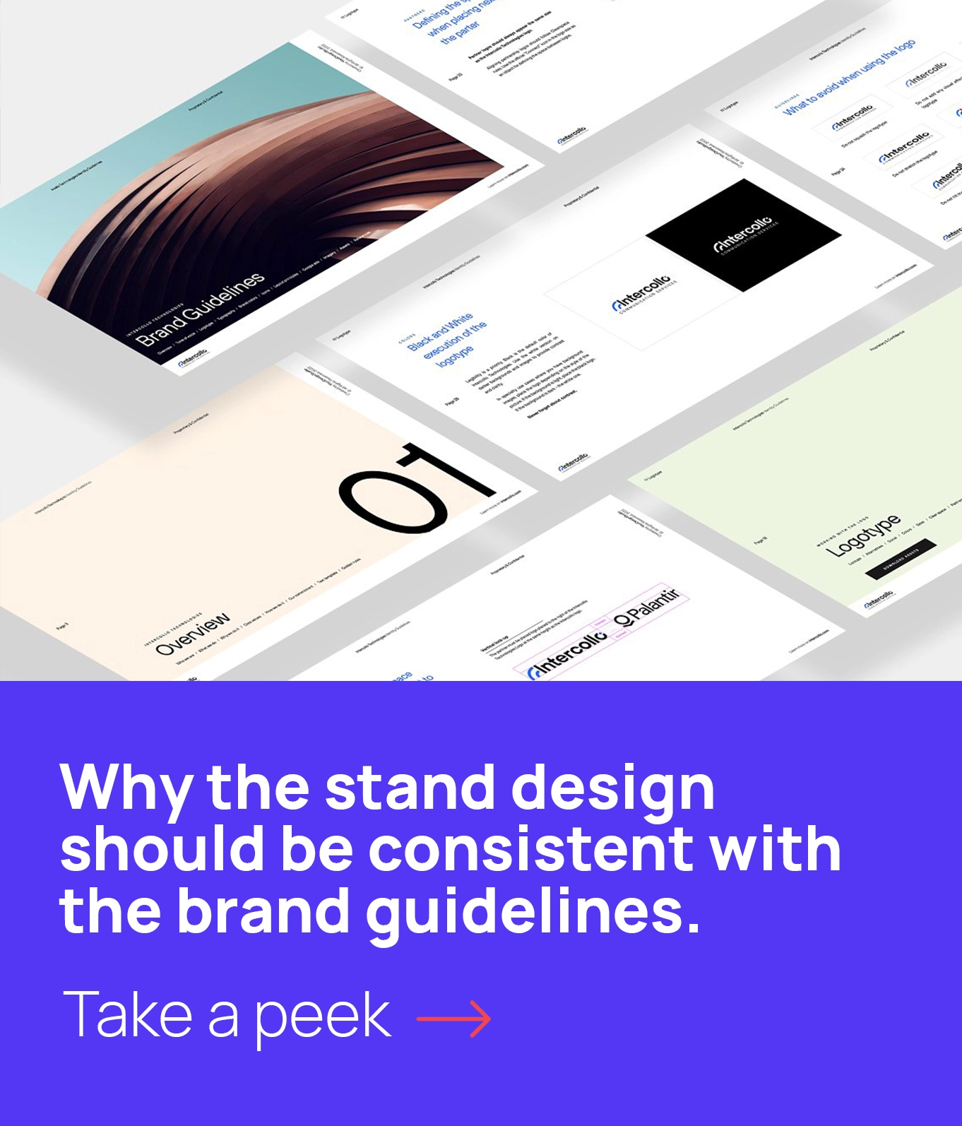
All the experts would say that the exhibition space is something you should get a lot of. The more square metres are coloured with the brand tints, the more attention and therefore the more deals the company will get. But what if the business simply can’t afford a monstrous space at the exhibition yet, and what they can get is only 12-20 square metres? Here’s where this article can be of a little help.
Be creative
In fact, any modern booth design should be creative, as otherwise there is no sense of participating in the fair. But when you have to draw the prospects’ attention to your tiny stand you should be twice as creative. The booth design should have some remarkable and attractive idea, some zest if you please. However, putting something extremely inviting into the stand design remember it only has to attract your target audience.
It’s about space, not about the things
Trying to stuff the exhibition booth with multiple elements is a huge mistake for tiny stands design. Aim for as little visual noise as possible and oddly it is expected to pay off. Limit the usage of graphic elements. Don’t try to exhibit all the company goods if there are many, only use the ones the company believes in the most. The surprising twist here is that the more objects and design elements appear within the small stand space – the cheaper it looks. So, get rid of the clutter, or better just don’t even plan on filling the space with the unnecessary.
Minimalistic approach is the key
Minimal space should be equipped in a minimalistic style. Look for clear lines, for elegant lighting, and for an attractive color palette. The design has to be reduced to the necessary elements only – “Less is more” rule works here perfectly.
“All you need is…”
The logo. That’s the face of your company, of your brand identity, you simply can’t do without it. The business description in less than 5 words. Most likely, you don’t have enough space to write more than 5 words to keep the type size legible (people should be able to see it from a long distance). The colors. Choose the minimal set of the colors from your brandbook and work within this limited palette. The “locker” zone. Even with a tiny space, the exhibitors will have plenty of empty boxes to hide and many printed POS-materials to keep, not to mention the overcoats and laptop cases. In our experience, the best way is to make this zone narrow and to hide it behind one of the walls. Thus it won’t create a visual clutter and will still be fully functional. To combine. If the company needs both a reception zone and a negotiations zone, the combo of two should be designed – an area that can serve both purposes. The tiniest space on the exhibition still can be competitive and can be capable of taking the visitors attention away from the huge exhibition monsters with an air balloon floating above them, you only need to design it correctly.


Leave A Comment